Welcome to the first part of our journey to build a multi-language blog using Astro.js. We realized how challenging it was to build the blog page at our official website Best Parents and we wanted to document our journey and perhaps help other developers with our solutions.
For this article, we will mainly be covering the core concepts of Astro.js as well as how to set up and configure your project. You will have your very own blog page (in development of course) by the end of this article. Let's begin!

Splash image courtesy of Chat GPT-4 and Dreamstudio.ai
Goals For The Project
- Understanding the fundamentals of the Astro Framework (Covered)
- Configure your project with Tailwind (Covered)
- Design a page to display all blog articles and a page for the individual blog articles (Covered)
- Use Astro Collections for your blog content (Covered)
- Use Astro-i18Next integration for translating your blog content
- Deploy your blog
- Methods to optimize the site SEO
Why Astro.js?
Astro.js has gained significant popularity in recent years due to its ability to optimise your website to maximise higher conversion rates with better SEO. The framework also boast numerous features that can help streamline the development process and enhance the user experience. These include:
- Component based development to build reusable UI that can be maintained easily.
- The option to seamlessly integrate with various frontend frameworks such as React, Vue.js, Svelte.
- Employs static site generation and intelligent caching to deliver pre-rendered pages instead of purely using server side rendering to render the page on each request.
- A simplified method to fetch data from multiple sources and APIs to render dynamic data alongside static content.
On top of these features, the framework is still actively being improved and the support from the community through discord has been great. I have had a great time with the framework myself and I hope that this guide will help kick start your Astro.js project!
Project Setup
Prerequisites
To create your first Astro project, you are going to need to install Nodejs. Install the right version based on your computer. The next thing you need is npm which is a node package manager for your project which conveniently comes with installing Nodejs. To test if you have installed them correctly, run the following commands in your terminal which should tell you the version number.
node -v
npm -v
Creating your project
Now, navigate to a path where you want to keep your Astro project and run the command below to create it:
npx create-Astro name-of-Astro-project
You will see the following options that you can choose to initialize your project. We have selected the following for this guide.
Astro   v2.9.2 Launch sequence initiated.

      ◼  dir Using name-of-Astro-project as project directory

  tmpl   How would you like to start your new project?
         Use blog template
      ✔  Template copied

  deps   Install dependencies?
         Yes
      ✔  Dependencies installed

    ts   Do you plan to write TypeScript?
         Yes

   use   How strict should TypeScript be?
         Strict
      ✔  TypeScript customized

   git   Initialize a new git repository?
         Yes
      ✔  Git initialized

  next   Liftoff confirmed. Explore your project!
Now, you can navigate to your editor of choice (I use vscode) and open your Astro project. In the editor's terminal, run npm run dev to start the development server. When it has completed building your project, you should see your project being hosted locally on http://localhost:3000/
🚀  Astro  v2.9.2 started in 240ms

  ┃ Local    http://localhost:3000/ # ctrl + click to open this url in your browser.
  ┃ Network  use --host to expose
Open it on the browser and you should see a webpage as shown below. Congratulations, you just built your first Astro Project!
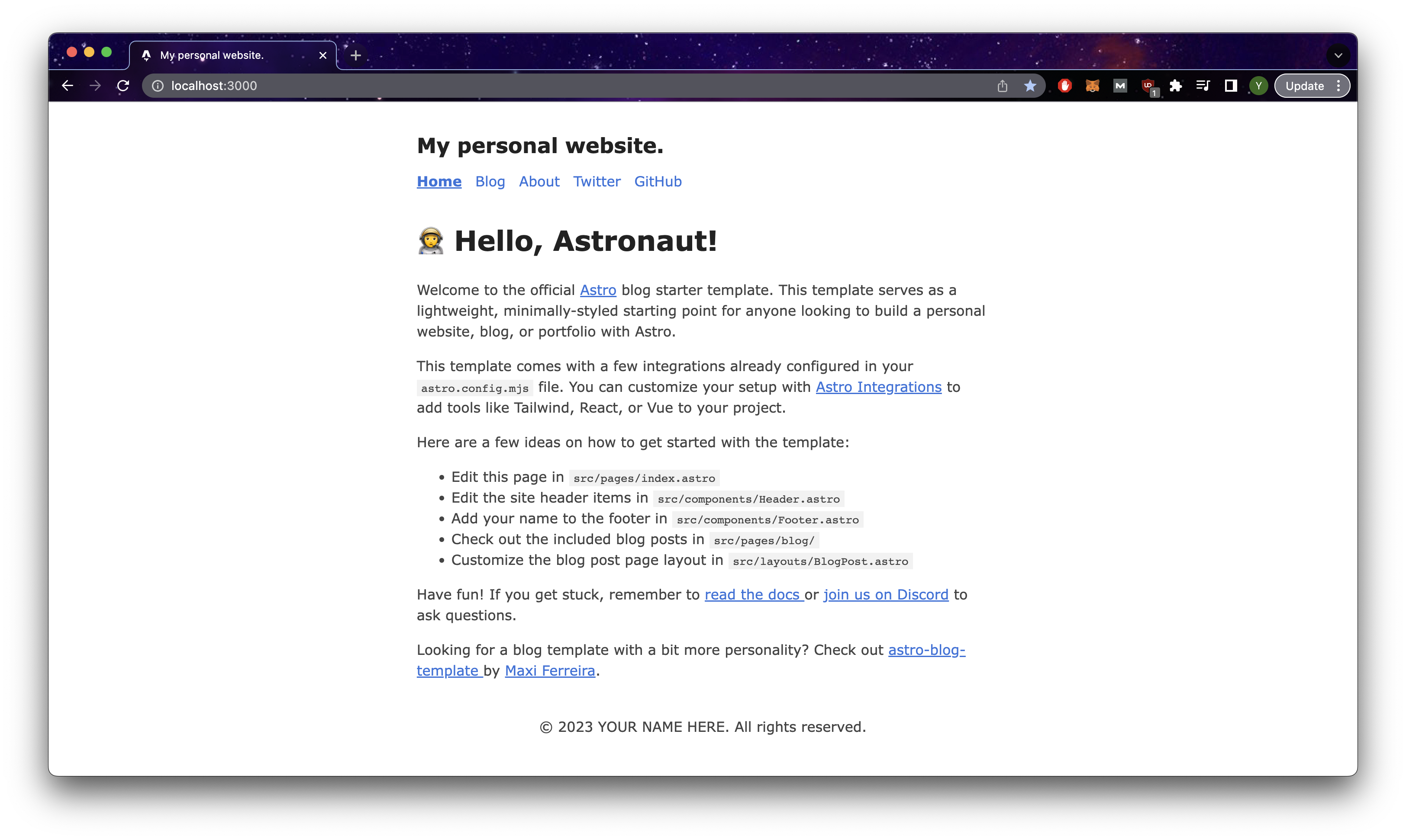
Your first Astro project!
Project Structure
Astro already provides some file structure to your project and it is important to know the key sections and what their purpose is for.
├── Astro.config.mjs
├── package-lock.json
├── package.json
├── public
│   ├── favicon.svg
│   ├── index.css
│   └── index.js
├── src
│   ├── components
│   │   └── BaseHead.Astro
│   │   └── Footer.Astro
│   │   └── ...
│   ├── content
│   │   └── blog
│   │   │   └── first-post.md
│   │   │   └── markdown-style-guide.md
│   │   │   └── ...
│   │   └── config.ts
│   ├── layouts
│   │   └── BlogPost.Astro
│   ├── pages
│   │   └── blog
│   │   │   └── [...slug].Astro
│   │   │   └── index.Astro
│   │   └── about.Astro
│   │   └── index.Astro
│   └── styles
│       └── global.css
│   └── utils
│ └── helper.ts- The
Astro.config.mjsfile is the configuration file for the Astrojs project where you include Astro integrations such as the css library tailwind. - The
publicdirectory contains the static assets of the project such as images and icons. - The
componentsdirectory is where you include your reusable components. - The
layoutsdirectory is where you include layouts that form the base structure each page - The
pagesdirectory is where you include the code for the pages in your site, where the name is the url path to view the page. - The
stylesdirectory is where you would put any style related files such as css or scss. - The
utils(optional) is a directory we created where you include helper functions to be shared throughout your project.
I know it may seem a little overwhelming if this your first project but keep reading and I will cover them in greater depth as we build the blog.
Pages, Layouts & Components
Pages are what essentially make up your website, and in your project, the pages directory is where you will define the code for your pages, but also the route to display the page in the browser via the URL. Each Astro file in this directory is a page for your website.
Basic Routing
├── pages
│   ├── about.Astro
│   └── index.Astro
For files shown above that are directly in the pages directory, the can be access via the following urls:
index.Astro: http://localhost:3000/
about.Astro: http://localhost:3000/about
It is important to note that index is a reserved file name that will not appear in the url, so it serves as a default.
Nested Routing
│   ├── pages
│   │   └── blog
│   │   │   └── [...slug].Astro
│   │   │   └── index.Astro
For nested routing, the directory name serves as the parent route name for a set of child routes. For files shown above that are directly in the pages directory, the can be access via the following urls:
index.Astro: http://localhost:3000/blog
about.Astro: http://localhost:3000/blog/anything-you-type
Dynamic Routes
[...slug].Astro is an example of a dynamic route where slug is a parameter you can access within the page in to pull the necessary data to populate the page. Do note that accessing the value of slug differs based on whether your site uses static site generation(SSG) or server side rendering(SSR) and you can find the documentation here. While defining it as [slug] would be sufficient, the addition of the spread operator allows for the page to match paths of any depth. You can read more about it here. In our case, we will be using server side rendering, so head over to Astro.config.mjs and add output:'server' to the config object and run the command below in the terminal to add an adapter which allows Astro to output a script that runs your project on a specific runtime. See more in the documentation here
npx Astro add node import { defineConfig } from 'Astro/config';
import mdx from '@Astrojs/mdx';
import sitemap from '@Astrojs/sitemap';
import node from "@Astrojs/node";
// https://Astro.build/config
export default defineConfig({
site: 'https://example.com',
integrations: [mdx(), sitemap()]
output: "server", // add this line
adapter: node({
mode: "standalone"
})
});Layouts
Each page essentially needs to contain html, head, body tags and it would be difficult to maintain if we coded them directly in each page. Instead, we will be layouts instead which serve as the foundation for each page. At its core, layouts are basically just Astro components that have the key tags for a webpage, and they are typically used to wrap the code for your pages file.
// BlogPost.Astro
---
import type { CollectionEntry } from 'Astro:content';
import BaseHead from '../components/BaseHead.Astro';
import Header from '../components/Header.Astro';
import Footer from '../components/Footer.Astro';
import FormattedDate from '../components/FormattedDate.Astro';

type Props = CollectionEntry<'blog'>['data'];

const { title, description, pubDate, updatedDate, heroImage } = Astro.props;
---

<html lang="en">
  <head>
    <BaseHead title={title} description={description} />
	<style>
		.title {
			font-size: 2em;
			margin: 0.25em 0 0;
		}
		hr {
			border-top: 1px solid #ddd;
			margin: 1rem 0;
		}
		.last-updated-on {
			font-style: italic;
		}
	</style>
  </head>

  <body>
	<Header />
	<main>
	  <article>
		{heroImage && <img width={720} height={360} src={heroImage} alt="" />}
		<h1 class="title">{title}</h1>
		<FormattedDate date={pubDate} />
		{
			updatedDate && (
				<div class="last-updated-on">
					Last updated on <FormattedDate date={updatedDate} />
				</div>
			)
		}
		<hr />
		<slot /> // external code goes here
	  </article>
	</main>
	<Footer />
  </body>
</html>
The slot element is where the external code placed between the layout component will be added. We can see this usage in [...slug].Astro.
//[...slug].Astro
import { CollectionEntry, getCollection } from 'Astro:content';
import BlogPost from '../../layouts/BlogPost.Astro';

export async function getStaticPaths() {
	const posts = await getCollection('blog');
	return posts.map((post) => ({
		params: { slug: post.slug },
		props: post,
	}));
}
type Props = CollectionEntry<'blog'>;

const post = Astro.props;
const { Content } = await post.render();
---

<BlogPost {...post.data}> // layout component
	<h1>{post.data.title}</h1> // external code
	<Content />
</BlogPost>
For our project, create a new layout and name it Layout.Astroand add the following to it. Additionally, make the home page of the website index.Astro use this layout component instead.
Layout.Astro
---
import Header from "../components/Header.Astro";
import Footer from "../components/Footer.Astro";
import "../styles/base.css";

export interface Props {
  title?: string;
  ignoreMaxWidth?: boolean;
}
let { title, ignoreMaxWidth } = Astro.props;
---

<html>
  <head>
    <meta charset="utf-8" />
    <meta name="viewport" content="width=device-width" />
    <meta name="generator" content={Astro.generator} />
    <title>{title}</title>
  </head>

  <body>
    <div class="w-full relative min-h-screen">
      <div class="px-6 pt-3 md:px-12 md:pt-6 w-full m-auto max-w-[1350px]">
        <Header />
      </div>
      <div
        class={ignoreMaxWidth
          ? ""
          : "px-6 pt-3 md:px-12 md:pt-6 w-full m-auto max-w-[1350px]"}
      >
        <slot />
      </div>
      <div class="px-6 pt-3 md:px-12 md:pt-6 w-full m-auto max-w-[1350px]">
        <Footer />
      </div>
    </div>
  </body>
</html>
index.Astro
---
import Layout from "../layouts/Layout.Astro";
---
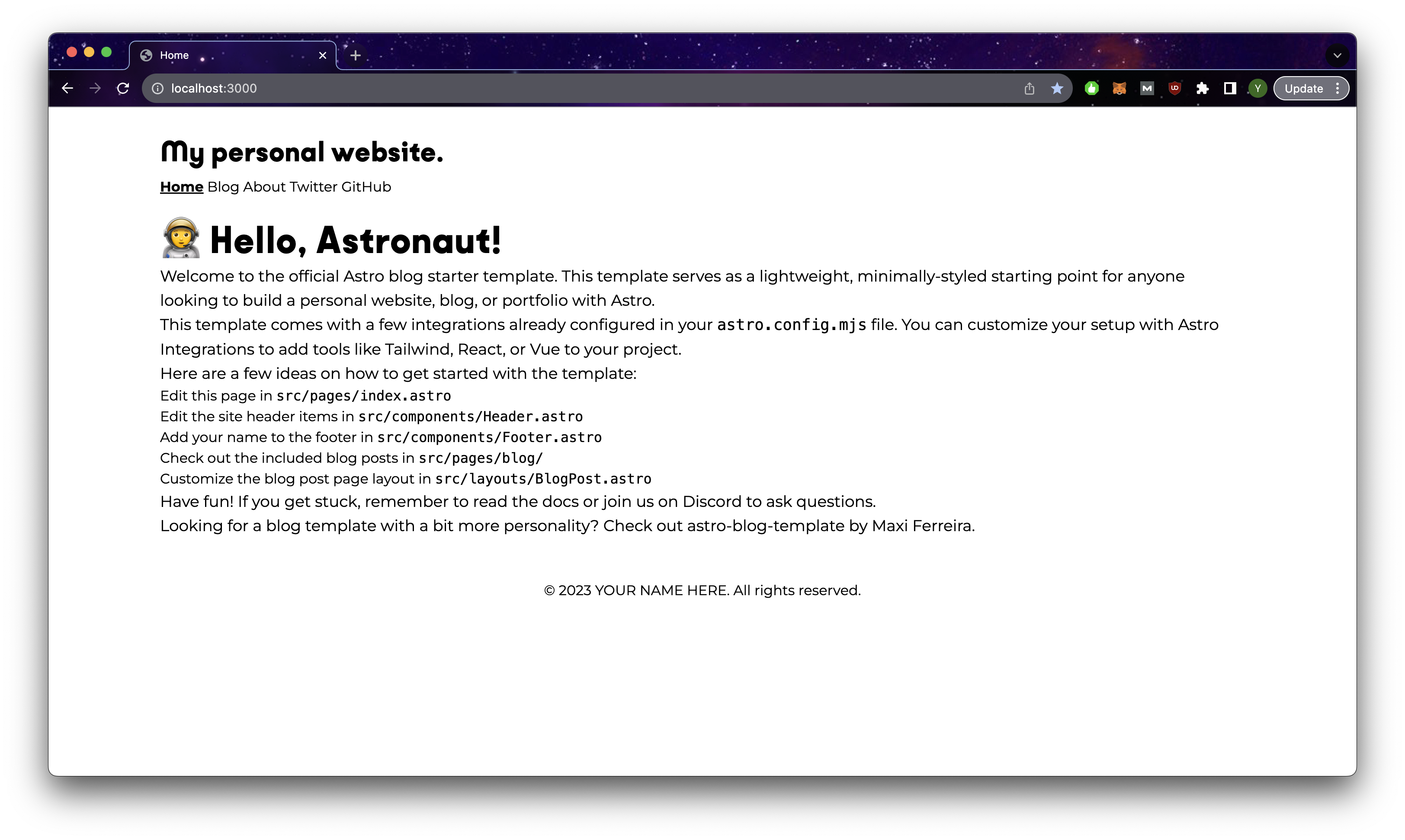
<Layout title="Home">
<main>
<h1>🧑🚀 Hello, Astronaut!</h1>
<p>
Welcome to the official <a href="https://Astro.build/">Astro</a> blog starter
template. This template serves as a lightweight, minimally-styled starting
point for anyone looking to build a personal website, blog, or portfolio with
Astro.
</p>
<p>
This template comes with a few integrations already configured in your
<code>Astro.config.mjs</code> file. You can customize your setup with
<a href="https://Astro.build/integrations">Astro Integrations</a> to add tools
like Tailwind, React, or Vue to your project.
</p>
<p>Here are a few ideas on how to get started with the template:</p>
<ul>
<li>Edit this page in <code>src/pages/index.Astro</code></li>
<li>
Edit the site header items in <code>src/components/Header.Astro</code>
</li>
<li>
Add your name to the footer in <code>src/components/Footer.Astro</code>
</li>
<li>
Check out the included blog posts in <code>src/pages/blog/</code>
</li>
<li>
Customize the blog post page layout in <code
>src/layouts/BlogPost.Astro</code
>
</li>
</ul>
<p>
Have fun! If you get stuck, remember to <a
href="https://docs.Astro.build/"
>read the docs
</a> or <a href="https://Astro.build/chat">join us on Discord</a> to ask questions.
</p>
<p>
Looking for a blog template with a bit more personality? Check out <a
href="https://github.com/Charca/Astro-blog-template"
>Astro-blog-template
</a> by <a href="https://twitter.com/Charca">Maxi Ferreira</a>.
</p>
</main>
</Layout>Components
Components are essentially just reusable chunks of code that we can reuse throughout the webpage. It is crucial to abstract design logic in our webpage design into reusable components as it can make your code base easier to maintain and more consistent in its design. Say for instance you had multiple pages using a similar chunk of code and you wanted to change the background colour. You would have to go to every file where this code is, find the exact line and modify the background colour property. This greatly increases your chance for error and takes time.
By using components, we not only circumvent this issue by only having 1 file to maintain for any changes, but we can also give it a meaningful name such as UserCard.Astro which makes our code more readable than raw html tags.
The name of components are the same as their file names and they must start with a capitol letter and be in camel case.
Components can take in props which are external data being passed to the component itself to deal with. This data can be anything from information that the component will display or boolean values to make the component customisable under certain conditions.
Additionally, components can also take in external code with the use of slots which specifies where the code will be inserted into. If you have multiple slots, you can even name the slots.
Here is an example component UserCard.Astro being used in a page Profile.Astro shown below:
// UserCard.Astro
---
export interface Props {
  name: string;
  href: string;
}

const { href, name } = Astro.props;
---

<li class="link-card">
  <a href={href}> // href data goes here
    <h2>
      {name} // name data goes here
    </h2>
    <slot name="content"/> // external code goes here
  </a>
</li>
// Profile.Astro
---
import UserCard from "../components/UserCard.Astro"
import users from "../../public/users.json"
---
<div class="flex gap-x-4">
{users.map(user => { // mapping through a list of user objects
return (
<UserCard
name={user.name} // name data
href={user.link} // href data
>
<div slot="content"> // specify slot to inject this code
<p>{user.content}</p>
</div>
</UserCard>
)
})
</div>Installing Tailwind
Tailwind CSS is a utility-first CSS framework that provides developers with low-level utility classes, enabling high customisation potential for your designs directly within your HTML code. Repetitive and verbose CSS is minimised, resulting in an overall more efficient development workflow. Furthermore, its configuration file allows for customisable design systems, tailored to your project's needs. It also has many handy features such as the responsive design patterns and built-in dark mode. I will be using tailwind for styling components for this guide. So let's get started!
Basic Routing
Astro makes it extremely easy to integrate tailwind. Simply run the command below. It will help install the relevant packages, modify Astro.config.mjs and add a tailwind.config.cjs file to your project
npx Astro add tailwindtailwind.config.cjs
/** @type {import('tailwindcss').Config} */
module.exports = {
  content: ["./src/**/*.{Astro,html,js,jsx,md,mdx,svelte,ts,tsx,vue}"],
  theme: {
    extend: {
    },
  },
  plugins: [],
};
If you are new tailwind, I recommend keeping the documentation in a separate tab as you code as you will need some time to get familiar with the classes. Simply use their search bar to find the css style attribute that you need. They provide lots of examples for each one and how to use them!
To test your integration, let's open up header component and remove the styles. We will then add the styles using tailwind classes instead.
---
import HeaderLink from './HeaderLink.Astro';
import { SITE_TITLE } from '../consts';
---

<header>
	<h2 class="text-4xl my-2 font-bold"> // added tailwind classes
		{SITE_TITLE}
	</h2>
	<nav>
		<HeaderLink href="/">Home</HeaderLink>
		<HeaderLink href="/blog">Blog</HeaderLink>
		<HeaderLink href="/about">About</HeaderLink>
		<HeaderLink href="https://twitter.com/Astrodotbuild" target="_blank">Twitter</HeaderLink>
		<HeaderLink href="https://github.com/withAstro/Astro" target="_blank">GitHub</HeaderLink>
	</nav>
</header>
// <style>
//	header {
//		margin: 0em 0 2em;
//	}
//	h2 {
//		margin: 0.5em 0;
//	}
//</style>
It looks different from what we had initially as Tailwind removes the base styles for heading tags and other elements so that we start with a clean slate that we will customise. But take note of the increase in size for the heading 'My personal Website', which means our Tailwind classes work!
Tailwind works if you see this!
However, you will notice that all the blog pages styles are missing now, and this is because tailwind injects a base.css file on all pages. To fix this and keep the default styling, you can add the following to Astro.config.mjs.
import { defineConfig } from 'Astro/config';
import mdx from '@Astrojs/mdx';
import sitemap from '@Astrojs/sitemap';
import node from "@Astrojs/node";
import tailwind from "@Astrojs/tailwind";

// https://Astro.build/config
export default defineConfig({
  site: 'https://example.com',
  integrations: [
  mdx(),
  sitemap(),
  tailwind({
    applyBaseStyles: false,
  }),] // add this line
  output: "server"
  adapter: node({
    mode: "standalone"
  })
});
/*base.css*/
@tailwind base;
@tailwind components;
@tailwind utilities;// Layout.Astro
---
import Header from "../components/Header.Astro";
import Footer from "../components/Footer.Astro";
import "../styles/base.css"; // add this
---
Page without base.css maintains the original styling
So let us add a couple of styles and fonts that would persist throughout our entire project in base.css. Firstly, for fonts, we would be adding them to our project locally which can reduce the time needed to retrieve the fonts as users access the webpage:
- Download the font files you want. In our case, we will be using Montserrat and all of it character types as we want to account for all possible languages for translations. Pick the weights you desire for your project, in our case it is just 400 and 700. We ignore the italic fonts as css can actually italicise fonts for you although it may look different from the actual one.
- Add the following to
base.css - Download the files at the bottom of the page, create a directory
public/fontsand add the font files there.
/* montserrat-regular - cyrillic_cyrillic-ext_latin_latin-ext_vietnamese */
@font-face {
  font-display: swap; /* Check https://developer.mozilla.org/en-US/docs/Web/CSS/@font-face/font-display for other options. */
  font-family: "Montserrat";
  font-style: normal;
  font-weight: 400;
  src: local("Montserrat"),
    url("/fonts/montserrat-v25-cyrillic_cyrillic-ext_latin_latin-ext_vietnamese-regular.woff2")
      format("woff2"); /* Chrome 36+, Opera 23+, Firefox 39+, Safari 12+, iOS 10+ */
}
/* montserrat-700 - cyrillic_cyrillic-ext_latin_latin-ext_vietnamese */
@font-face {
  font-display: swap; /* Check https://developer.mozilla.org/en-US/docs/Web/CSS/@font-face/font-display for other options. */
  font-family: "Montserrat";
  font-style: normal;
  font-weight: 700;
  src: local("Montserrat"),
    url("/fonts/montserrat-v25-cyrillic_cyrillic-ext_latin_latin-ext_vietnamese-700.woff2")
      format("woff2"); /* Chrome 36+, Opera 23+, Firefox 39+, Safari 12+, iOS 10+ */
}- Download the files at the bottom of the page, create a directory
public/fontsand add the font files there. - Test out the fonts by adding the following to
base.css
html {
  font-family: Montserrat, Helvetica, sans-serif;
  font-style: normal;
  font-weight: 400;
  scroll-behavior: smooth;
}
Your webpage should look like this
Custom fonts in action
- As a final step, we need to let tailwind know that Montserrat should be part of our font family, so we add them to
tailwind.config.cjs. We can then test to make sure this works by replacing the code in base.css as shown below.
// tailwind.config.cjs
/** @type {import('tailwindcss').Config} */
module.exports = {
  content: ["./src/**/*.{Astro,html,js,jsx,md,mdx,svelte,ts,tsx,vue}"],
  theme: {
    extend: {
    },
    fontFamily: {
      sans: ["Montserrat", "sans-serif"], // sans-serif is our fallback font
    },
  },
  plugins: [],
};
/*base.css*/
/* html {
font-family: Montserrat, Helvetica, sans-serif;
font-style: normal;
font-weight: 400;
scroll-behavior: smooth;
} */
@layer base {
html {
@apply font-sans; /* Montserrat should still be applied */
}
}In the step above, we are now limiting all the possible fonts to only sans. This actually helps to reduce the bundled tailwind size as does import all the other predefined font classes which we are unlikely to use. We usually do this for theme related classes such as colors as we want to keep the theme of our website consistent and it prevents us from using colors that is not explicitly defined by us. However, if you intend to add more classes to the existing predefined tailwind classes, we will add them in the extend key instead. Here is an example of our theme below:
theme: {
    extend: {
      screens: { // on top of the predefined screen sizes, we added one more breakpoint
        "xs": "475px"
      },
    },
    colors: { // we are limiting possible colours we can use
      gray: {
        primary: "#f7f7f7",
        secondary: "#E2E8F0",
        dark: "#848884",
        darker: "#4A5568"
      },
      black: "#000000",
      orange: {
        primary:"#e86826",
        secondary: "#e9763a"
        },
      yellow: "#F4B32A",
      white: "#ffffff",
      beige: "#f1eae0",
      transparent: "transparent",
    },

    fontFamily: {
      sans: ["Montserrat", "sans-serif"],
      hs: ["Kobe11", "sans-serif"],
    },
},- In the case of our blog, we also add another set of fonts specifically for header elements. Try repeating the steps above and create a new font class in
tailwind.config.cjs. In this case we added a font called Kobe11 of weight 400 and 900 (remember to download the fonts and store them locally). We then defined a new font family that uses Kobe11. We will be using this font in the next step.
/*base.css*/
@font-face {
  font-family: "Kobe11";
  src: local("kobe11"), url(/fonts/Kobe1.1-Regular.woff2) format("woff2");
  font-display: swap;
  font-style: normal;
  font-weight: 400;
}
@font-face {
  font-family: "Kobe11";
  src: local("kobe11"), url(/fonts/kobe11-black.woff) format("woff");
  font-display: swap;
  font-style: normal;
  font-weight: 900;
  line-height: 112px;
  /* or 112% */

  letter-spacing: 0.18105px;
}
// tailwind.config.cjs
fontFamily: {
sans: ["Montserrat", "sans-serif"],
hs: ["Kobe11", "sans-serif"],
},- Finally let us add some additional styles for specific elements that would be common throughout our webpage. This makes it way easier to refactor should we need to make any changes. In the event we need to customise the element style, we can apply styles directly on the elements themselves that would override the ones in
base.css
/*base.css*/
@layer base {
  html {
    @apply bg-gray-primary text-base;
  }
  p {
    @apply md:text-lg break-words;
  }
  pre{
    @apply break-words whitespace-pre-line;
  }
  h1 {
    @apply font-hs md:text-[48px] md:leading-[1.1] text-4xl font-black;
  }
  h2 {
    @apply font-hs md:text-4xl text-3xl mt-8 font-black;
  }
  h3 {
    @apply font-hs text-2xl mt-2;
  }
}
Your webpage should look like this
Header and body custom fonts
Building the Blog Page
Basic Structure
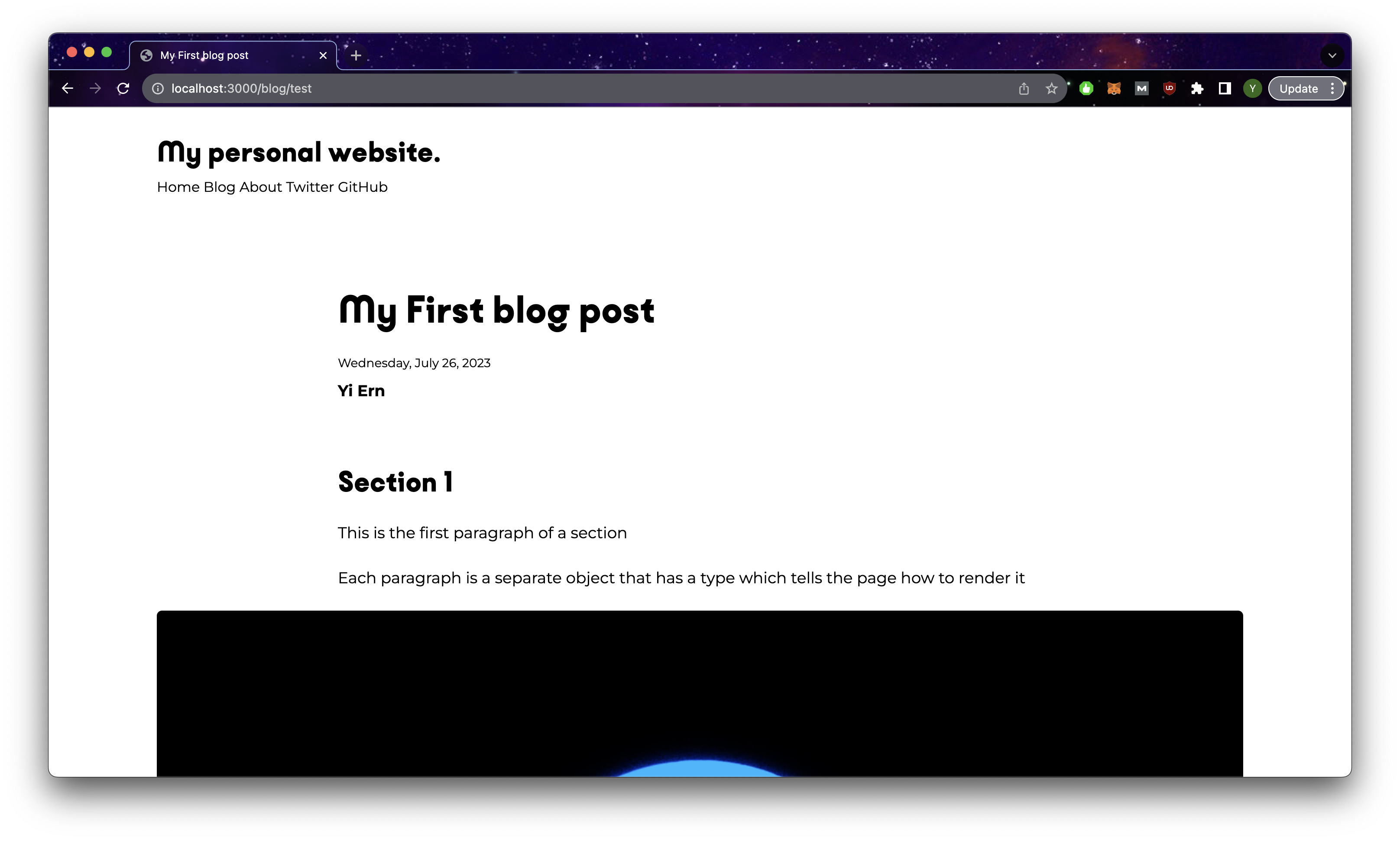
Now that we have tailwind and configured some of the generic styles, we can finally move on to building the actual blog page! In our case, let us start with [...slug].Astro which is the page that will be displaying the content of the blog. We will be using a dummy json file for now so that you can see the changes. We will eventually use the content collections feature of Astro to add our json files there.
Now blogData may seem quite overwhelming, but the general idea is that the top values are the key information for the article such as the author, date, title, etc. Then we get to the sections object which has a title, paragraphs which is the main body of content that can render a variety of content, and a single image that is rendered below the content. In the event we need to add 2 pictures in a row, we just create an empty section with just the image portion filled up.
//[...slug].Astro:
---
import LinkButton from "../../components/LinkButton.Astro";
import Layout from "../../layouts/Layout.Astro";
const blogData = {
  title: "My First blog post",
  author: "yiern",
  description: "This is my first blog post ever using Astro.js!",
  date: "2023/07/26",
  slug: "test",
  featured: "false",
  coverImageURL: "/placeholder-hero.jpg",
  coverImageAlt: "hero placeholder",
  sections: [
    {
      title: "Section 1",
      paragraphs: [
        {
          type: "basic",
          content: "This is the first paragraph of a section",
        },
        {
          type: "basic",
          content:
            "Each paragraph is a separate object that has a type which tells the page how to render it",
        },
      ],
      imageURL: "/placeholder-about.jpg",
      imageAlt: "placeholder about",
      imageSubtitle: "",
      imageOriginalSize: "false",
      imageSizes: "",
    },
    {
      title: "Section 2",
      paragraphs: [
        {
          type: "setHTML",
          content:
            "In the event we need to add any html capabilities to our content such as a <a class='blog-link' href='/'>link</a> or a line of <code>console.log(code)</code>",
        },

        {
          type: "unorderedList",
          content: [
            "You can also have lists or onordered lists.",
            "Just take note that we need to style them ourselves with tailwind",
          ],
        },
        {
          type: "LinkButton",
          content: {
            buttonText: "We can even add components",
            buttonLink: "/",
          },
        },
      ],
      imageURL: "/placeholder-hero.jpg",
      imageAlt: "placeholder hero",
      imageSubtitle: "",
      imageOriginalSize: "false",
      imageSizes: "",
    },
  ],
};
---

<Layout title={blogData.title}>
  <div class="mx-auto">
    <header>
      <div class="md:w-2/3 w-full mx-auto mb-10 md:mt-20 mt-10">
        <h1 class="mx-auto">{blogData.title}</h1>
        <p class="mt-6 text-sm">
          {blogData.date}
        </p>
        <p class="mt-2">
          <a class="blog-link" href="" target="_blank">{blogData.author}</a>
        </p>
      </div>
    </header>
    <section class="grid grid-cols-1 gap-y-6 mt-4 justify-items-center">
      {
        blogData.sections.map((section) => (
          <>
            {section.title && (
              <div class="md:w-2/3 w-full">
                <h2>{section.title}</h2>
              </div>
            )}
            {section.paragraphs.map((paragraph) => {
              switch (paragraph.type) {
                case "orderedList":
                  return (
                    <ol>
                      {paragraph.content.map((item) => (
                        <li class="ltr:pl-4 rtl:pr-4" set:html={item} />
                      ))}
                    </ol>
                  );
                case "unorderedList":
                  return (
                    <ul>
                      {paragraph.content.map((item) => (
                        <li class="ltr:pl-4 rtl:pr-4" set:html={item} />
                      ))}
                    </ul>
                  );

//                case "setHTML":
//                  return (
//                    <div class="md:w-2/3 w-full">
//                      <p set:html={paragraph.content} />
//                    </div>
//                  );
//                case "LinkButton":
//                  return (
//                    <LinkButton
//                      btnStyle="btn-orange"
//                      href={paragraph.content.buttonLink}
//                    >
//                      {paragraph.content.buttonText}
//                    </LinkButton>
//                  );
                default:
                  return (
                    <div class="md:w-2/3 w-full">
                      <p>{paragraph.content}</p>
                    </div>
                  );
              }
            })}
            {section.imageURL && (
              <>
                <div
                  class={`rounded-md overflow-hidden
                    ${
                      section.imageOriginalSize === "true"
                        ? "w-fit mx-auto"
                        : "aspect-[3/2] w-full"
                    }`}
                >
                  <img
                    loading="lazy"
                    src={section.imageURL}
                    alt={section.imageAlt}
                    class={`rounded-md w-full h-full ${
                      section.imageOriginalSize === "true"
                        ? "object-contain"
                        : "object-cover"
                    }`}
                  />
                </div>
                {section.imageSubtitle && (
                  <div class="md:w-2/3 w-full">
                    <p
                      set:html={section.imageSubtitle}
                      class="text-center text-sm"
                    />
                  </div>
                )}
              </>
            )}
          </>
        ))
      }
    </section>
  </div>
</Layout>
To see the page itself, use the url /blog/test (recall that [...slug] accepts a dynamic url so it doesn't really matter what you put after /blog at this point) and you should see the following on your page:
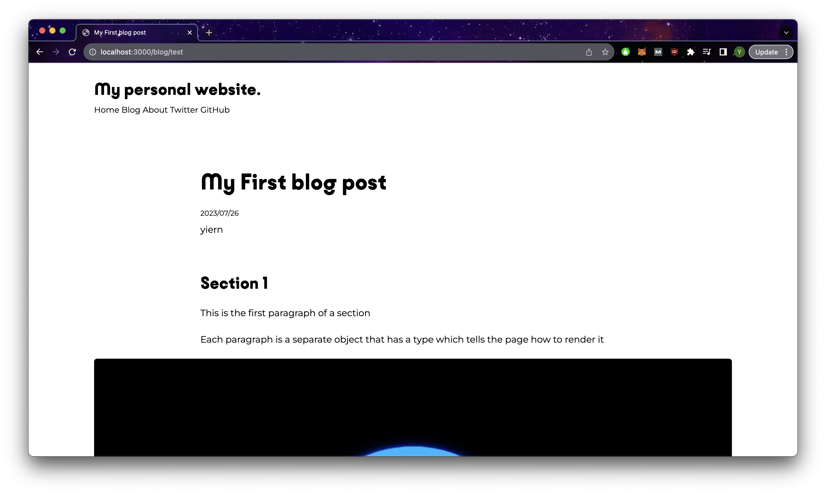
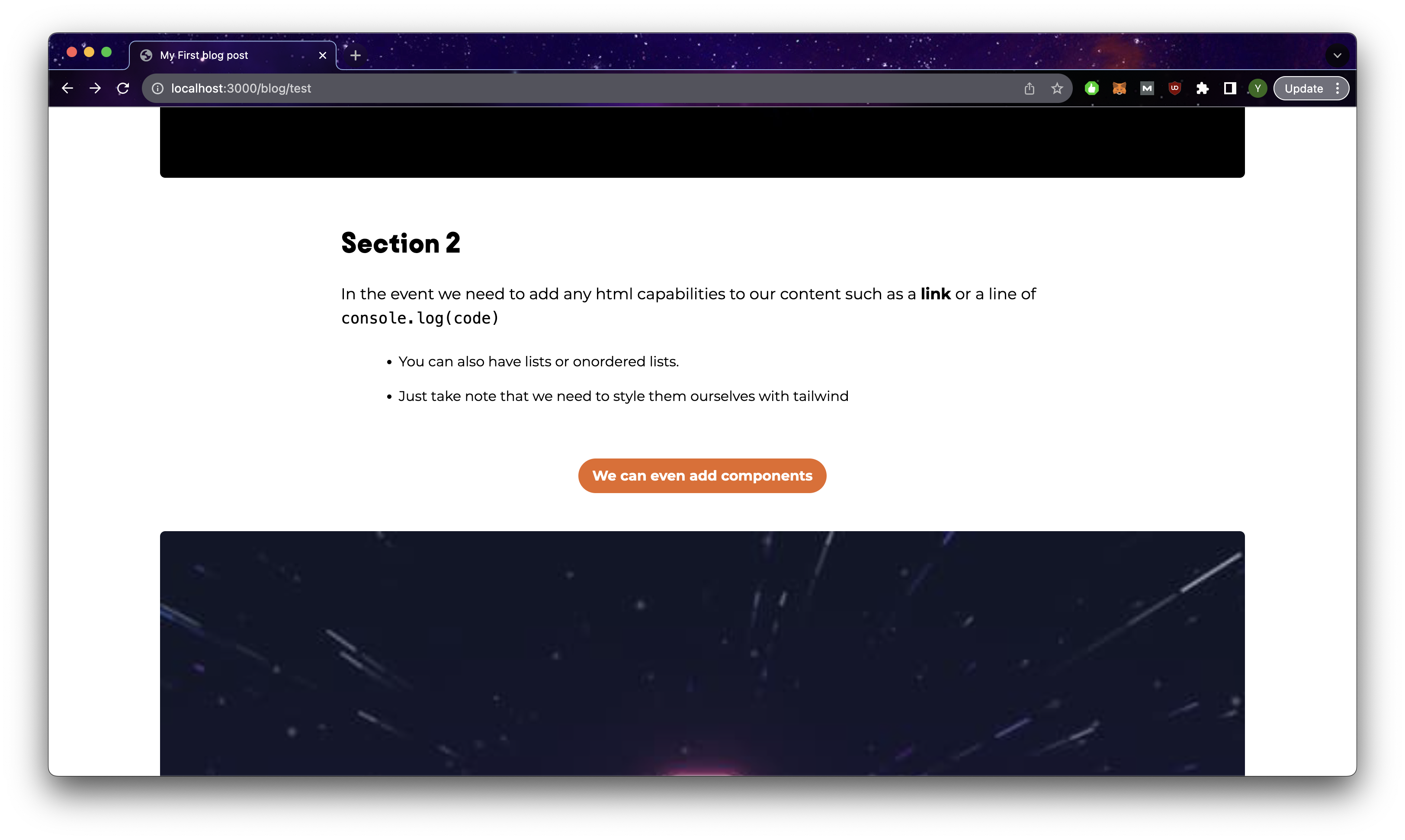
Adding html directly into the content
We see in section 2, some of the content seems to be broken so let us fix that. In the event we need to have html tags in our content such as anchor links or code blocks, we can insert he html directly into the content and use set:html which will render them as actual html elements unlike the example shown below.
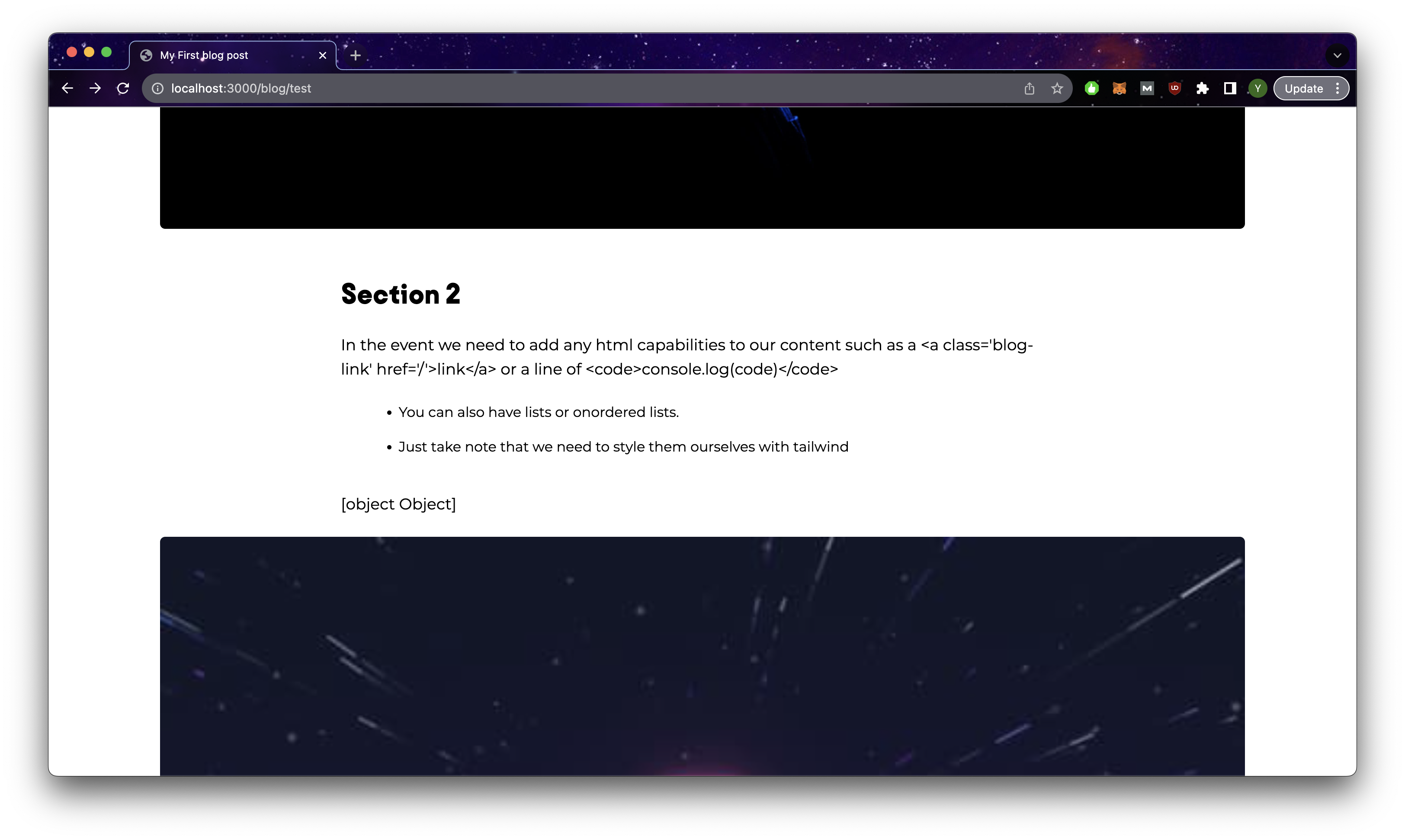
To fix this, we just uncomment out the setHTML block of code in index.Astro and add the class blog-link to our base.css.
@layer components {
 .blog-link {
    @apply hover:underline underline-offset-2 hover:text-orange-primary font-bold cursor-pointer;
  }
}
Styling elements with tailwind and style tags
Next we need to deal with the issue of the ordered and unordered list elements. They are being rendered as expected, but they are missing some styling due to tailwind stripping those styles away. Let us add this block of css styles in index.Astro and we should see the styled version
// index.Astro
...
</Layout>
<style>
  ol {
    @apply list-decimal md:w-[56%] w-[80%] mx-auto list-outside;
  }
  ul {
    @apply list-disc md:w-[56%] w-[80%] mx-auto list-outside;
  }
  li {
    @apply pb-4;
  }
</style>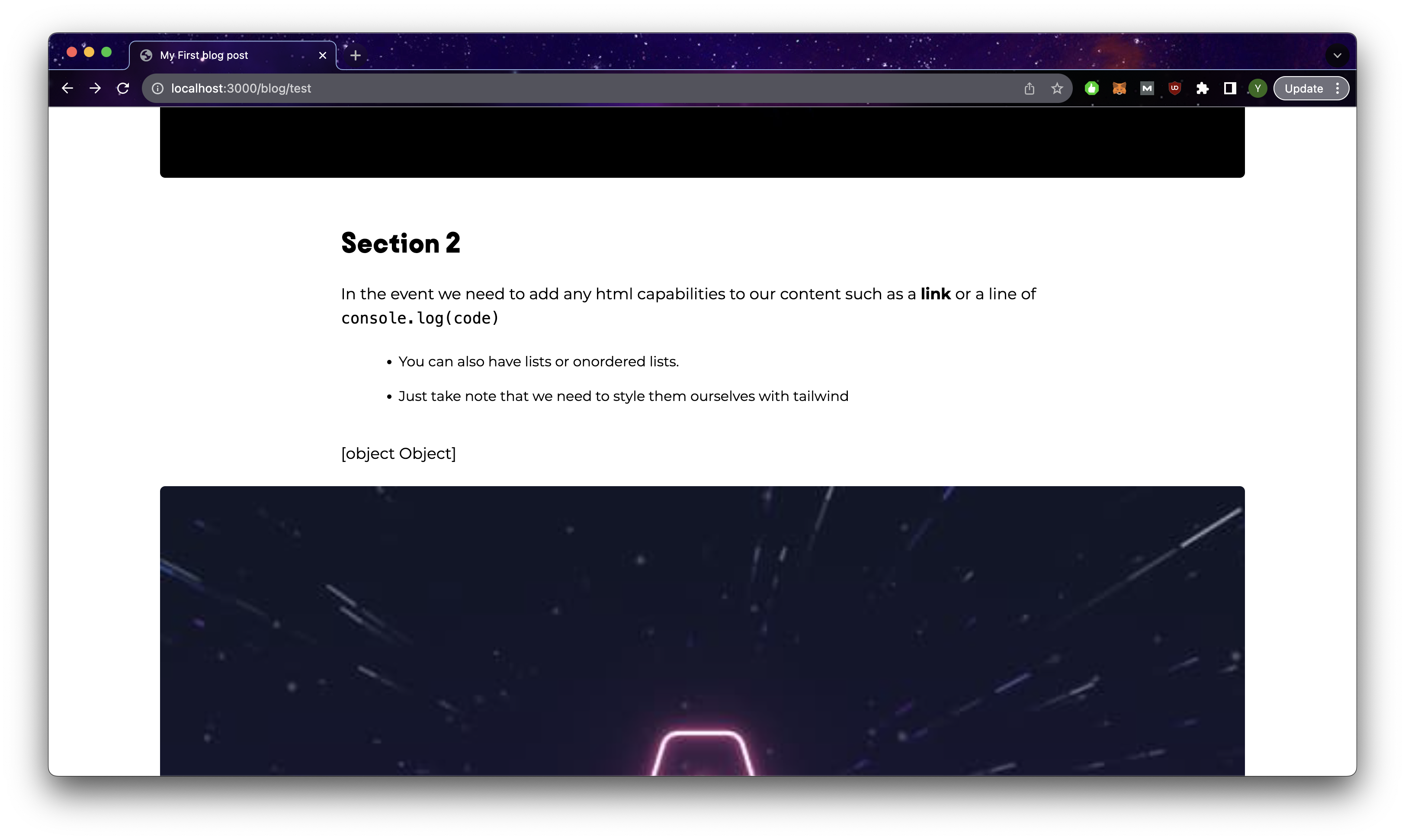
Adding components from the JSON file
To take this blog page one step further, we can also render components into the page itself. Let us first create a component LinkButton.Astro in out components folder with the following code and add a new class btn-orange to style our button in base.css. Then import the component and uncomment out the LinkButton portion of code in index.Astro.
// LinkButton.Astro
---
export interface Props {
  href: string;
  btnStyle: string;
  target?: string;
  ariaLabel?: string
}

const { href, btnStyle, target, ariaLabel } = Astro.props;
---

<a
  href={href}
  class={`my-5 block text-center py-2 ${btnStyle}`}
  target={target}
  aria-label={ariaLabel}
>
  <slot />
</a>
/*base.css*/
@layer components {
  .blog-link {
    @apply hover:underline underline-offset-2 hover:text-orange-primary font-bold cursor-pointer;
  }
  .btn-orange {
    @apply bg-orange-primary h-10 px-4 rounded-full font-bold text-center text-white hover:bg-gray-secondary transition ease-in disabled:opacity-50 disabled:hover:bg-orange-primary;
  }
}
The page should now look like this:
Your blog page is completed
By this point, we have discussed where we should include the code that forms the structure of our webpage (components, layouts and pages) and we have seen how to use them to form our blog page in the section above. However, this only forms the structure of the page which we will reuse for all of our blog posts.
The blog content itself will be stored separately in an Astro feature called content collections. The project already has an example of this in the src/content directory. The name of your collections will match the name of the folder and each entry within your collection will be identified by the file name. config.ts is the file where we will define the schema of our collection which every entry must follow. Astro will check these files at build time and throws an error if the json content does not match the schema.
│   ├── content
│   │   └── blog // blog collection
│   │   │   └── first-post.md // blog collection entry
│   │   │   └── markdown-style-guide.md
│   │   │   └── ...
│   │   └── config.ts
The straightforward way is to use markdown/mdx for your content. It handles many of the styles a typical article would need such as lists, links, tables and headings. Additionally, you can easily render images hosted on a CDN or in the public folder of your project! With mdx, you have the additional benefit of being able to add javascript to make your content even more interactive. You can see the guide in the documentation.
However, the downside to this is that it becomes tricky to customize the layout of your blog and the styling as the html that is being rendered is done entirely by Astro. Additionally, translating markdown or mdx files can be tricky as they may not follow a consistent pattern and have tons of symbols that may trip up the translation. Hence in our blog, I will be showing you how you can use json instead to contain your blog content and control how the content will be rendered.
Content Collection
Remove the object defined in [...slug].js and add it as a json instead to /content/blog/test.json. Additionally, lets add another entry to /content/authors/yiern.json, which will host the content for authors.
// test.js
// WARNING: JSON SYNTAX IS SUPER SENSITIVE, COPY THIS FILE DIRECTLY INSTEAD OF
// DIRECTLY COPYING THE JAVASCRIPT OBJECT
{
  "title": "My First blog post",
  "author": "yiern",
  "description": "This is my first blog post ever using Astro.js!",
  "date": "2023/07/26",
  "slug": "test",
  "featured": "false",
  "coverImageURL": "/placeholder-hero.jpg",
  "coverImageAlt": "hero placeholder",
  "sections": [
    {
      "title": "Section 1",
      "paragraphs": [
        {
          "type": "basic",
          "content": "This is the first paragraph of a section"
        },
        {
          "type": "basic",
          "content":
            "Each paragraph is a separate object that has a type which tells the page how to render it"
        }
      ],
      "imageURL": "/placeholder-about.jpg",
      "imageAlt": "placeholder about",
      "imageSubtitle": "",
      "imageOriginalSize": "false",
      "imageSizes": ""
    },
    {
      "title": "Section 2",
      "paragraphs": [
        {
          "type": "setHTML",
          "content":
            "In the event we need to add any html capabilities to our content such as a <a class='blog-link' href='/'>link</a> or a line of <code>console.log(code)</code>"
        },

        {
          "type": "unorderedList",
          "content": [
            "You can also have lists or onordered lists.",
            "Just take note that we need to style them ourselves with tailwind"
          ]
        },
        {
          "type": "LinkButton",
          "content": {
            "buttonText": "We can even add components",
            "buttonLink": "/"
          }
        }
      ],
      "imageURL": "/placeholder-hero.jpg",
      "imageAlt": "placeholder hero",
      "imageSubtitle": "",
      "imageOriginalSize": "false",
      "imageSizes": ""
    }
  ]
}
// yiern.json
{
"_name": "Yi Ern",
"_socialLink": "https://www.linkedin.com/in/yiern-goh"
}Collection Config
As mentioned earlier, collections need to follow some predefined structure and we will define them in the /content/config.ts file. Remove the pre-existing code and replace it with the code below and add a new file to /content/_schemata.ts
defineCollectionis the function that is used to create a collection schema, and we use'data'as the collection type in our case as we are using json to store the content.zhere refers to the zod library which comes built in with Astro. It is used to define types and makes the validation of your schemas easier. Read more in the documentation.- To reference other collection schemas, we use reference and add the name of the desired collection as an argument. This reduces the need for us to redefine the schema again. An example of this is
authors: reference('authors') - We can define other schemas outside of
config.jsin the event we need to use them it in multiple collections. Do note that this is not the same as the point made above in 3, we are only defining part of the schema, not an entirely new collection schema. An example of this iscontent:z.string().or(listSchema).or(linkButtonSchema)where the schemas are imported from_schemata.ts. (We could have simply just defined them inconfig.tsas well, this is more to keep things organized)
import { defineCollection, reference, z } from "Astro:content";
import {listSchema, linkButtonSchema} from "./_schemata";
const blog = defineCollection({
  type: "data",
  schema: z.object({
    title: z.string(),
    author: reference("authors"), // references objects from the authors collection
    description: z.string(),
    date: z.string().transform((str) => new Date(str)),
    slug: z.string(),
    featured: z.string().transform((str) => str === "true"),
    coverImageURL: z.string(),
    coverImageAlt: z.string(),
    sections: z.array(
      z.object({
        title: z.string(),
        paragraphs: z.array(
          z.object({
            type: z.enum([
              "basic",
              "setHTML",
              "orderedList",
              "unorderedList",
              "LinkButton",
            ]),
            content: z.string().or(listSchema).or(linkButtonSchema),
          })
        ),
        imageURL: z.string(),
        imageAlt: z.string(),
        imageSubtitle: z.string(),
        imageOriginalSize: z.string().transform((str) => str === "true"),
        imageSizes: z.string(),
      })
    ),
  }),
});

const authors = defineCollection({
  type: "data",
  schema: z.object({
    name: z.string(),
    socialLink: z.string().url(),
  }),
});
// config.ts
export const collections = {
  authors,
  blog,
};
// _schemata.ts
import { z } from "Astro:content";
const linkButtonSchema = z.object({
buttonText: z.string(),
_buttonLink: z.string(),
});
const listSchema = z.array(z.string());Blog Post Page
Now that we have defined the actual content collection, it is time for us to access it and display it on our blog page via [...slug].Astro.
- To access a specific collection entry, we will put the name in the url and get the value via
const {slug} = Astro.params, which in this case should betestif we went to the url: http://localhost:3000/blog/test - We will then access the json content using
getEntry({CollectionName}, {EntryName})and do a check to see if the request was successful or not. Do note that for reference to other collection entries, we will need to request them separately again as shown in the example below withauthor. To access the actual content, we can do so viaentry.datawhich is where it resides - We made some additional changes to the code as indicated by the comments below. Do remove them in your project to prevent any errors. A broad explanation for these changes would be that when we get the entry from Astro collections, the zod typing actually converts those strings into actual values as indicated by the types. So date strings are transformed into actual date objects and 'true/false' are transformed into booleans.
---
import LinkButton from "../../components/LinkButton.Astro";
import Layout from "../../layouts/Layout.Astro";
import { getEntry } from "Astro:content";
import { linkButtonSchema, listSchema } from "../../content/_schemata";

let options: Intl.DateTimeFormatOptions = {
  weekday: "long",
  year: "numeric",
  month: "long",
  day: "numeric",
};
const { slug } = Astro.params;
if (slug === undefined) {
  throw new Error("Slug is required");
}

const entry = await getEntry("blog", slug);
if (entry === undefined) {
  return Astro.redirect("/404");
}

const author = await getEntry("authors", entry.data.author.id);
if (author === undefined) {
  throw new Error(
    `Author with id:${entry.data.author.id} could not be found in authors collection`
  );
}
const blogData = entry.data;
---

<Layout title={blogData.title}>
  <div class="mx-auto">
    <header>
      <div class="md:w-2/3 w-full mx-auto mb-10 md:mt-20 mt-10">
        <h1 class="mx-auto">{blogData.title}</h1>
        <p class="mt-6 text-sm">
          //<!-- Format date object  -->
          {blogData.date.toLocaleDateString("en-US", options)}
        </p>
        <p class="mt-2">
          //<!-- Get data from author entry -->
          <a class="blog-link" href={author.data.socialLink} target="_blank"
            >{author.data.name}</a
          >
        </p>
      </div>
    </header>
    <section class="grid grid-cols-1 gap-y-6 mt-4 justify-items-center">
      {
        blogData.sections.map((section) => (
          <>
            {section.title && (
              <div class="md:w-2/3 w-full">
                <h2>{section.title}</h2>
              </div>
            )}
            {section.paragraphs.map((paragraph) => {
              switch (paragraph.type) {
                case "orderedList":
                  return (
                    <ol>
                      //<!-- So typescript doesnt throw and error -->
                      {listSchema.parse(paragraph.content).map((item) => (
                        <li class="ltr:pl-4 rtl:pr-4" set:html={item} />
                      ))}
                    </ol>
                  );
                case "unorderedList":
                  return (
                    <ul>
                      {listSchema.parse(paragraph.content).map((item) => (
                        <li class="ltr:pl-4 rtl:pr-4" set:html={item} />
                      ))}
                    </ul>
                  );

                case "setHTML":
                  return (
                    <div class="md:w-2/3 w-full">
                      <p set:html={paragraph.content} />
                    </div>
                  );
                case "LinkButton":
                  return (
                    <LinkButton
                      btnStyle="btn-orange"
                      href={
                      //<!-- So typescript doesnt throw and error -->
                        linkButtonSchema.parse(paragraph.content).buttonLink
                      }
                    >
                      {linkButtonSchema.parse(paragraph.content).buttonText}
                    </LinkButton>
                  );
                default:
                  return (
                    <div class="md:w-2/3 w-full">
                      <p>{paragraph.content}</p>
                    </div>
                  );
              }
            })}
            {section.imageURL && (
              <>
                <div
                  class={`rounded-md overflow-hidden
                    ${
                      //<!-- Actual Boolean now -->
                      section.imageOriginalSize
                        ? "w-fit mx-auto"
                        : "aspect-[3/2] w-full"
                    }`}
                >
                  <img
                    loading="lazy"
                    src={section.imageURL}
                    alt={section.imageAlt}
                    class={`rounded-md w-full h-full ${
                      //<!-- Actual Boolean now -->
                      section.imageOriginalSize
                        ? "object-contain"
                        : "object-cover"
                    }`}
                  />
                </div>
                {section.imageSubtitle && (
                  <div class="md:w-2/3 w-full">
                    <p
                      set:html={section.imageSubtitle}
                      class="text-center text-sm"
                    />
                  </div>
                )}
              </>
            )}
          </>
        ))
      }
    </section>
  </div>
</Layout>
<style>
  ol {
    @apply list-decimal md:w-[56%] w-[80%] mx-auto list-outside;
  }
  ul {
    @apply list-disc md:w-[56%] w-[80%] mx-auto list-outside;
  }
  li {
    @apply pb-4;
  }
</style>
So if all goes well, your blog page should now look something like this where the author is now a link and the date is formatted nicely.
Blog page now has the author link and properly formatted date
Blog Index Page
Now that we have the individual pages for our blog working, it is time to revisit the index page of the blog where the user will be able to browse all blog posts. In this case, we would need to retrieve and display multiple entires. So let us first add in a few additional copies of blog articles called test2.json and test3.json where we modify the title and slug to a value corresponding to the file name. You can also change coverImageURL to some other value so we can see the difference. Finally, for test.json change featured to true. /content/blog should look something like this now:
│   ├── content
│   │   └── blog
│   │   │   └── test.json -> title: "My First blog post", slug: "test", featured: "true"
│   │   │   └── test2.json -> title: "My Second blog post", slug: "test2", featured: "false"
│   │   │   └── test3.json -> title: "My Third blog post", slug: "test3", featured: "false"
│   │   └── config.ts
For the index page, replace the content with the code below.
- We can get the entire collection by simply using
getCollection({CollectionName})and we get an array of blog entires - We then filter out the
featuredPost(test.jsonin our case as we set the value of featured to be true) which we will be displaying at the top of the index page. Then remove the featured post from the other blog posts and set it asotherPosts - For the href value of anchor tags, we need to include both the parent path and the slug e.g
/blog/{Post Slug}. Or else, you will be redirected to the 404 page which is the expected behavior coded out in[...slug].Astro. - We added some custom style for the headers which will override the styles we declared in
base.css
---
import Layout from "../../layouts/Layout.Astro";
import LinkButton from "../../components/LinkButton.Astro";
import { getCollection, getEntry } from "Astro:content";

let options: Intl.DateTimeFormatOptions = {
  weekday: "long",
  year: "numeric",
  month: "long",
  day: "numeric",
};
const blogPosts = await getCollection("blog");
const featuredPost = blogPosts.filter(({ data }) => data.featured).pop();
if (featuredPost === undefined) {
  throw new Error(
    "Please set a post to be featured by setting the 'feature' key to 'true'."
  );
}
const otherPosts = blogPosts.filter(({ data }) => !data.featured);
---
<Layout title={"Blog"}>
  <header
    class="grid md:grid-cols-12 grid-col-4 md:gap-x-5 md:mt-20 mt-10 md:gap-y-0 gap-y-6 items-center"
  >
    <div
      class="md:hidden inline-block col-span-4 aspect-[3/2] rounded-md overflow-hidden"
    >
      <a href={`blog/${featuredPost.data.slug}`}>
        <img
          src={featuredPost.data.coverImageURL}
          alt={featuredPost.data.coverImageAlt}
          class="w-full h-full object-cover"
        />
      </a>
    </div>
    <div
      class="inline-block md:col-start-1 md:col-end-6 md:ltr:pr-4 md:rtl:pl-4 md:col-span-5 col-span-4"
    >
      <div class="mt-1 mb-2 text-sm cursor-default">
        <time
          >{featuredPost.data.date.toLocaleDateString("en-US", options)}</time
        >
      </div>
      <h1 class="hover:underline underline-offset-2">
        <a href={`blog/${featuredPost.data.slug}`}>{featuredPost.data.title}</a>
      </h1>

      <LinkButton
        href={`blog/${featuredPost.data.slug}`}
        btnStyle="btn-orange w-fit"
      >
        Read More
      </LinkButton>
    </div>
    <div
      class="md:inline-block hidden col-start-6 col-end-[-1] aspect-[3/2] rounded-md overflow-hidden"
    >
      <a href={`blog/${featuredPost.data.slug}`} class="">
        <img
          src={featuredPost.data.coverImageURL}
          alt={featuredPost.data.coverImageAlt}
          class="w-full h-full object-cover"
        />
      </a>
    </div>
  </header>

  {
    otherPosts.length > 0 && (
      <section class="md:mt-20 mt-10">
        <h2>Latest Articles</h2>
        <div class="grid lg:grid-cols-12 md:grid-col-6 md:grid-col-4 gap-x-5 md:gap-y-10 gap-y-6 md:mt-10 mt-6">
          {otherPosts.map(({ data }) => (
            <article class="md:col-span-6 col-span-4">
              <div class="grid md:grid-cols-6 grid-cols-4 gap-x-5">
                <div class="md:col-span-3 col-span-2 rounded-md overflow-hidden aspect-[3/2]">
                  <a href={`blog/${data.slug}`}>
                    <img
                      src={data.coverImageURL}
                      alt={data.coverImageAlt}
                      class="block rounded-md w-full h-full object-cover"
                    />
                  </a>
                </div>
                <div class="md:col-span-3 col-span-2">
                  <h3 class="hover:underline underline-offset-2 w-full">
                    <a href={`blog/${data.slug}`}>{data.title}</a>
                  </h3>
                  <div class="mt-2 sm:text-sm text-xs cursor-default">
                    <time>
                      {data.date.toLocaleDateString("en-US", options)}
                    </time>
                  </div>
                </div>
              </div>
            </article>
          ))}
        </div>
      </section>
    )
  }
</Layout>
<style>
  h1 {
    @apply font-hs lg:text-[48px] lg:leading-[1.1] md:text-4xl sm:text-3xl text-2xl;
  }
  h2 {
    @apply font-hs sm:text-4xl text-3xl;
  }
  h3 {
    @apply font-hs sm:text-2xl text-base;
  }
</style>
So if everything goes well, you should see something like that when you visit http://localhost:3000/blog. When you click into the posts, you should be redirected into the blog post page itself. Congratulations, you have a functioning blog on Astro!!
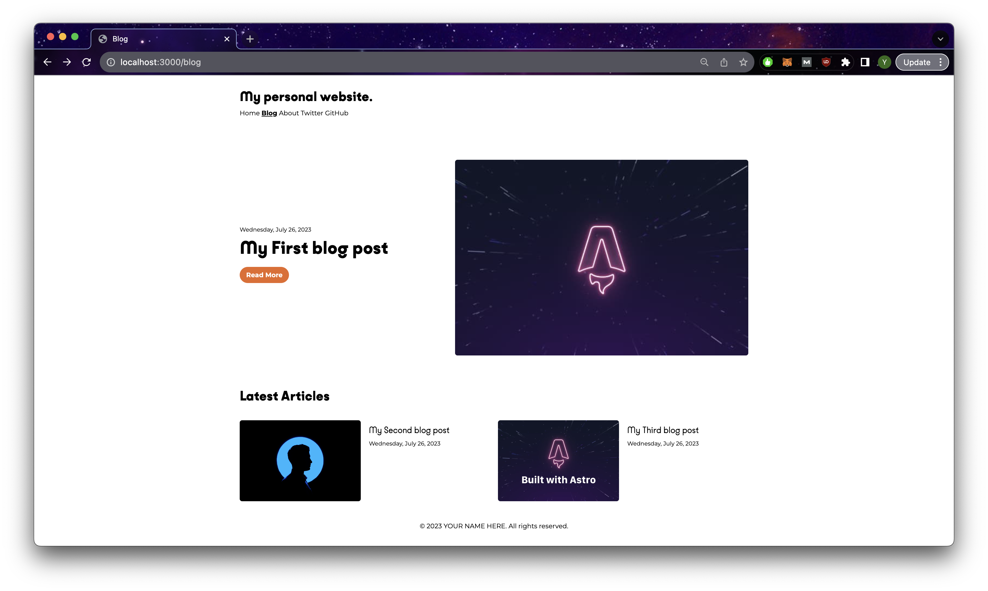
Your blog index page!
Putting it all together
By this point, we managed to achieve a functioning blog built entirely on Astro.js (Bonus: the pages we created have a responsive design too!). We have also managed to set up all the essential configurations for our blog as well such as SSR and Tailwind. So now all that is left really, is to make our blog look cooler! You can find the code on github.
- Header.astro: Added the company logo, a link to the about page and official website. Added a mobile side navigation menu.
- Footer.astro: Added a link to the official website and used tailwind classes instead
- Layout.astro & tailwind.config.cjs: Added in an SVG bubble that makes the background look less monotonous.
- about.astro, FounderContent.astro: Created a simplified version of our original about page with a link to the official website.
- index.astro & [...slug].astro: Moved them directly into /pages directory as this website is meant purely for blog articles. Modified the links to make sure they still linked to the blog pages correctly. I also added 2 more modifications where we can now modify the starting value of ordered lists as well as the ability to add sub headers in the sections.
- base.css: Changed the background color of the webpage and added a word break for long words/code blocks which broke the mobile view
I hope things went smoothly for you in this article, please feel free to reach out to me on linkedIn if you noticed anything that I can do to improve this article. See you again in part 2!